This is part 1 of a multi-part article that covers these topics:
Part 1 -Â Switching from iOS (iPhone 4) to Android (Galaxy Note 3) & my favorite Android apps / accessories recommendationsÂ
Part 2 – Samsung Galaxy Note 3’s camera test & recommendations for best Android camera apps
Introduction
I recently made the transition from Apple’s iOS (iPhone 4) to Android (Samsung Galaxy Note 3), and the transition’s been traumatic–more so than I could have predicted. I had spent months doing research on iOS app equivalents for Android, learning about the Android ecosystem, reading reviews and tips & tricks for the Note 3, hanging out at Android forums, etc, but as soon as I received my Note 3 in the mail and started trying to customize it, all the problems I couldn’t have foreseen started popping up left and right. During the process of solving of these problems I’ve learned a lot, and I’m now going to share those insights, so the information can help those going through similar problems, or are just looking for some tips & tricks for the Note 3 or Android they didn’t already know.
Why I switched from iOS to Android, and why the Galaxy Note 3 (and some Android music-making apps)
First of all, I should preface by explaining that I’m not a fan of Apple in general. I dislike the snobbery, the tyrannical control that restricts user customization (though I can now see the benefit, having dealt with the wide-open world of Android and the downside of all that freedom), the annoying insistence on using blinding white backgrounds for GUI design (iTunes, iOS), the “premium designer price tag” schtick, the “creative people all use Mac” crap, and so on. I avoided Apple for as much as I could all these years, and the only reason I grudgingly started using iOS products was because Android’s implementation of audio in terms of latency (and also hardware compatibility) was not good enough for more serious music-creation (although things have slowly gotten better on Android, and there are now a good number of music-making apps on Android too. Android Musician is a great website that gathers all the best music-making apps and categorizes them. I’ll give my recommendations later too).
When I got my first iOS device (4th generation iPod Touch), I was still knee-deep in music-making at the time (I’m taking a break from it right now to focus on writing novels), and I wanted to use the DAW/sequencing apps to sketch out music ideas while not in my studio (apps like Xewton’s Music Studio/Image-line’s FL Studio Mobile, NanoStudio, BeatMaker 2, Harmonicdog’s MultiTrack, Garage Band, etc). There are also a long list of virtual instruments, synthesizers, drum machines, guitar multi-effects, etc, available on the iOS. Then when Elena got an extra iPhone 4 as a gift, she gave the surplus one to me. That iPhone 4 became my main mobile device, and the iTouch was rarely ever used, since the iPhone 4 was better in every way (display, camera, and with phone features).
Even though I never did much with those music apps (the touch screen GUI just didn’t allow the kind of quick editing or expressive performance control I needed, and attaching an external MIDI controller defeats the purpose of having a small portable device), I’m a tech-oriented guy by nature, so soon I found ways to utilize the iPhone 4 in my daily life that made it indispensable. This, eventually became one of the main problems of transitioning to Android, because the process of finding Android equivalent apps that I relied was a long and tedious one that required a lot of research and testing of various apps.
But why did I switch to Android? Mainly for these following reasons:
-The iPhone 4 isn’t powerful enough to browse the web smoothly. Pages took a long time to load, and scrolling through the pages is often a clunky experience full of stutters and freezes. I could upgrade to the iPhone 5, except the screen is just too small to do any serious content creation comfortably. You can do it, but it feels very restricting.
-I hate the iOS keyboard, and Apple does not allow you to customize it or use third-party designs. I found a workaround by using writer’s apps such as Nebulus Notes and Write For iPhone, as they allow you to customize the keyboard, but outside of specialized apps, you’re still stuck with that damn keyboard.
-Can’t access/navigate folder structures like on a computer
-Cannot replace battery
-Cannot use memory cards to extend storage capacity
-Can’t customize iOS beyond the most simple basics
The catalyst for the switch was when I kept seeing people mentioning ting as a great alternative to the big carriers like AT&T, Verizon, T-Mobile, Sprint, etc. I went to ting’s website and I was just floored by how much more logical and fair their business model was. You only pay for the minutes/data/texts you use, instead of having to pick a package, think about rollover minutes, get charged for going over limits, and the rest of that nonsense. ting even has a simple calculator that let’s you figure out how much money you can save by switching to ting, and the difference was profound. If you’ve never been to ting’s site and are interested, definitely go and check it out:Â https://ting.com (You get a $25 dollar off discount if you use that link.) The only problem was, at the time, ting did not have iPhones on their list of available devices (but now they do).
After mulling over the pros and cons of switching (from iOS to Android, and from AT&T to ting), it seemed like a no-brainer, so I started to research what Android device to switch to. I looked at all the options (HTC, Sony, Motorola, Google Nexus, Nokia Lumia, etc) and eventually settled on the Samsung Galaxy Note 3. Here are the main reasons:
-Since switching to ting was the main motivation, I could only pick a device ting supports, and the Galaxy Note 3 was confirmed to be added to the line-up soon.
-The large display is satisfying without being too large for one-handed use.
-I wanted the S Pen, because I like the idea of having a stylus that performs at a similar level in pressure sensitivity as professional digital tablets for visual artists (the Note 3’s S Pen uses technology from Wacom, the de facto standard in digital tablets, used ubiquitously by visual artists around the world). This is something that the iPhone does not have (and although Wacom now makes the Intuos Creative stylus for the iPad, the nib is gigantic due to technical limitation of the iOS screen sensing, and not nearly as accurate for finer details).  Handwriting notes is also much more intuitive/faster than typing on a tiny touchscreen keyboard (and no, writing with a finger is not nearly as smooth).
-Can use microSD card to expand storage space.
-Easy to replace battery (carrying a spare battery makes a world of difference when out all day)
-Cutting-edge specs. with a fast quad-core 2.3 GHz Snapdragon 800 processor and 3GB of RAM.
From the time I first decided to switch to ting and chose the Note 3 (this was back in August of 2013, and the Note 3 was still only a rumor and not officially announced yet), it took three months for me to finally get the Note 3 in my hands. The wait was a special form of torture (those of you who are knee-deep in the world of fast-paced tech gadget evolution understands this), but it gave me ample time to do research on how to make the transition from iOS to Android as smooth as possible. As it turned out, no amount of research prepared me–it was still a frustrating experience despite all the research I did.
Making the transition from iOS to Android
Although I prepared myself with a bunch of available videos and articles on the web about the Android ecosystem and Galaxy Note 3, it was still a culture shock to be faced with an astounding number of customizable settings. This is the double-edged sword; you can customize the hell out of your device, but you have to put in the time and energy to do it and work through a lot of trial and error and do an insane amount of research. Some setting are cryptic and you’d have to do detective work to figure out what the hell it actually does. For the tech-savvy control freaks, Android really hits the spot, but for the rest of the population, it is way overkill for their simple needs, and this is where Apple succeeds–they make devices that you can’t customize beyond the bare minimum basics, but you’d never get lost in them either. I can see the pros and cons of each, and for my personality, I definitely prefer flexibility over simplicity, even though I have to pay for that preference with a lot of time and patience (the fact my personality type is INTJ just makes it worse; every time I get into something new, I work my ass off until I become at least a minor expert at it before I allow myself to relax).Â
Samsung provides a fairly painless way for you to transition from another device to the Galaxy Note 3, in the form of the Smart Switch app. You install it on your computer and it searches for itunes sync settings, iOS backups, etc, and then transfers your contacts, wallpapers, phone/message history, music, photos, videos, etc to the Note 3. While in theory this works, in practice, if you are meticulous about storage directory arrangement, it’s not ideal, because the transferred content is put into one big folder for each media type, instead of proper folder/sub-folder structure. Â So right away, I had to solve this problem. But before I get into all the apps and the camera, let’s first get the hardware accessories out of the way.
Hardware Accessories
This is how I’ve customized my Note 3 at the hardware level:

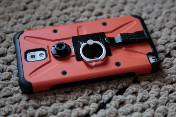
There are five piece of hardware accessories attached to my Note 3, and they are:
Urban Armor Gear case – I believe in being prepared, because I’m a klutz (so is Elena–we are so clumsy that we often unwillingly provide amusement for others). There’s no way in hell I would ever not use a protective armor case for a device that I can easily drop and costs so much (I bought my Note 3 full price, without contract). I searched high and low, considered aesthetics vs. functionality, and in the end, I had to give up on the classy cases such as beautifully carved wood and vintage leather cases and go for something that’s more pragmatic. The Urban Armor Gear series had the right level of protection as well as cool looking aesthetics (if you’re into the high-tech industrial look). I chose the Outland design, because ever since I laid eyes on an orange Waldorf Microwave synthesizer keyboard all those years ago, I have been a fan of that bright industrial orange offset with black and white. As much as I love earthy and classy understated color palettes in most situations, for some reason orange just does it for me. Yellow-green too, especially when offset with black and white. There’s something refreshing and bold about those combinations.
MIME Ghost Glass Protector – Since I’m not going with a flip cover styled case this time (like I did with the iPhone 4 and the gorgeous Spigen vintage leather case I used for it), I needed a glass protector that was heavy duty, but still very sensitive for the stylus. This one was the best reviewed option on Amazon.
Nite Ize eCLIPse Self Locking Clip – This neat little thing self-locks when you clip it onto your clothes, shoulder straps, pockets, etc, and it is extremely secure, because you have to press on a release flap in order to take it off. It was too effective, and I had to sand the locking teeth down a bit so it didn’t bite so hard onto whatever you clip it onto.
Ultra Swivel Belt Clip (ANTI-POPOUT PROTECTION)Â – This carrying system is awesome. I used one like it about twelve years ago for a cellphone, and I liked it very much then too. It basically allows you to clip your phone onto a secure clip that attaches to your clothes, belt, or bag, and its unique design prevents accidental releases. This is a far more elegant solution than the typical holster/pouch option, since the clip is so tiny that does not get in the way at all. I just clip it onto the lip of my jeans pocket, and never have to think about it.
Here’s a video demonstrating how it works, although the version shown is the normal one without the anti-popout protection. What the anti-popout does, is only allow the knob to insert or exit the lock when it’s rotated 90 degrees, providing extra security that prevents accidental releases.
iRing – If you have ever accidentally dropped your mobile device while using it, you should get this. This little gadget allows you to hold on to your device much more securely, while also doubles as a kickstand, or even allow you to hang your device onto any hook. The ring folds down when not in use and gets out of your way. I’ve compared this to the Bunker Ring (a competing product), and this one has a lower profile and pivots at the center, thus more ergonomic.
When you use the iRing, you can pretty much stop worrying about dropping your device (it’s like extra security on top of the protective case and screen), and it makes a huge difference in how comfortable you can get with operating the device in any situation:
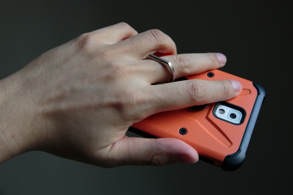
You can rotate the ring in any direction you want, matching the way you hold the device:
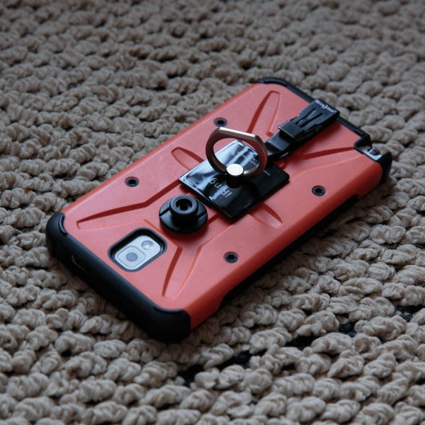
When rotated vertically, the ring becomes a very solid kickstand:
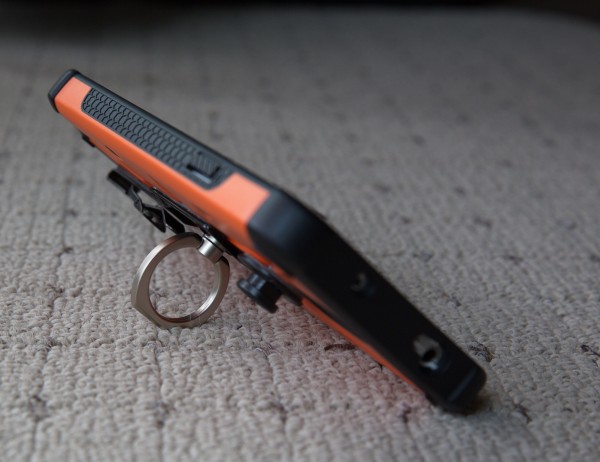
The attached accessories don’t add much thickness to the overall device, and provide so much more convenience:
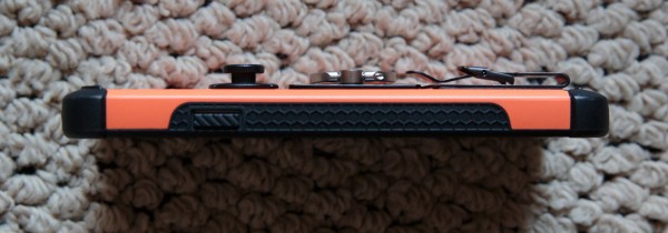
Although the extra attachments don’t hinder at all in terms of holding and operating the device, do be careful when you buy other accessories like stands or car mounts, because some of them are designed only for the naked phone without any protective case or other extra accessories attached. I did run into a bit of problem because of the attachments I’ve added. After a bit of trial and error, I eventually found the right accessories to match my decked out Note 3, and I’ll mention them below.
A quick tip for those of you who want to add the above attachments to your phone’s case: If your case is not perfectly flat and has ridges like the Urban Armor Gear I use, you can cut piece of 3M tape to “cushion” under areas where the attachments are hanging over the edge of recessed spots, thus still able to allow the attachments to stick to the case completely.
Here are other useful hardware accessories I use:
Rabbit Mini Portable Stand – This very small and portable stand is great for traveling, but it isn’t too sturdy, as you can tip your device over if you press on the screen too hard while it’s on the stand. But for watching videos while on a plane or on a desk it’s just fine.
Portable Fold-Up Stand – This stand is much more sturdy and flexible than the Rabbit Mini, and is great for everyday use on your desk. Although it was designed for tablets, you can change the angle of the anchoring feet, so you can use it for phones of any size. I fixed it on the desk with 3M Dual-Lock (low profile version), so it stays put no matter how hard I press on the screen, but can still be pulled off when I want to take it somewhere. It’s a lot bigger than the Rabbit Mini Portable stand (about the size of a banana when folded up), but it’s still very portable. (I did try another stand before this one–the Elago M2, but as nice as it was, it couldn’t fit the thickness of my decked out Note 3).
iKross Car Vehicle Windshield Suction Mount Holder – Although this car mount tends to vibrate harder than the iOttie I tried, it can fit my Note 3 with the armor case and attached accessories, while the iOttie couldn’t. Previously I used a smaller iOttie for my iPhone 4 and it worked well, although once a while it did pop off and I had to re-attach it. The iKross attaches to the windshield so it’s far less likely to pop off compared to car mounts that attach to the dashboard itself:
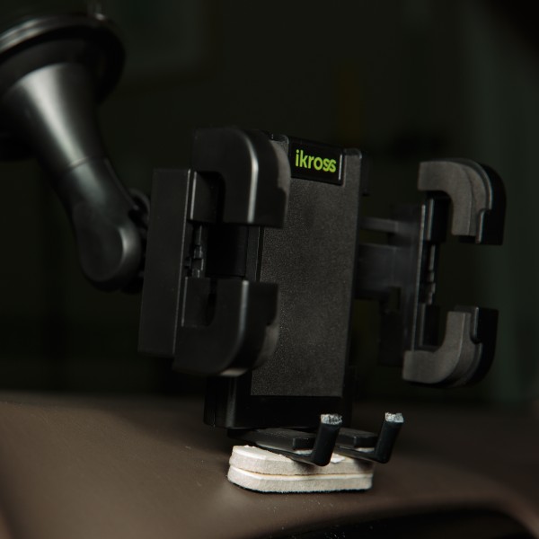
The iKross’s bottom anchors are barely deep enough to accommodate the thickness of my decked out Note 3, so I modified it by attaching a couple of plastic pieces I cut out of a garbage bag clip with double-sided 3M tape. I also attached two pieces of felt cushion at the bottom to reduce the vibration of the Note 3 while the car is moving.
Samsung Spare Battery Charging System – The Note 3 chews through the battery much faster than something like the iPhone because of the far larger screen, and if you are out for a whole day or traveling and you are using the Note 3 a lot, you likely won’t make it to the end of the day, so a spare battery will be necessary. It’s smaller than carrying one of those battery booster packs and has its own charger.
Speaking of battery, I should mention that if you charge your Android device from a computer, it will go very slow, regardless if you are using a USB 3.0 or 2.0. If you charge from a wall outlet, it will be several times faster. For example, if your battery is nearly empty and you charge with a computer’s USB port, it will take you probably around eight hours for a full charge, while a wall outlet will only take about two and a half hours at most.
SanDisk Ultra 64 GB microSDXC – One of the major draws of Android is that some devices take memory cards, allowing the user to expand the storage significantly without having to pay the ridiculous premium for versions with more storage. Typically, you’d have to pay $100 extra for the next model up in storage space, but with memory cards, you’d only need to pay about half of that amount and get far more additional storage space.
The first microSD card I got was the Samsung 64GB Pro, thinking that because it’s also made by Samsung, the compatibility with the Note 3 would be better. I was wrong. The Samsung microSD card was plagued with all kinds of problems, and I wasted so much time trying to troubleshoot all the malfunctions caused by Samsung’s microSD card. I returned it and got the SanDisk Ultra 64 GB instead, and all those problems went away.
Okay, we’re done with hardware accessories. Now let’s get into apps.Â
(Many of the apps I recommend below have free/trial versions, and if I have upgraded to the paid version, I’ll only link to the paid version, so make sure you check and see if there’s a free version for you to try. The easiest way to check is to simply click on the developer’s link on the app’s page.)
Sync Apps
As I mentioned previously, Android does not have any all-in-one sync solution like iTunes, and you must piece together your complete syncing solution by combining different apps. I tried Kies 3, iSyncr, doubleTwist, SyncMe Wireless, Synctunes, Cheetah Sync, SugarSync, etc, and while they all worked for some things, they were not one-stop solutions I had hoped for due to various issues (such as only being able to sync certain types of files, or when syncing, makes a mess of the folder structure and does more harm than good). As much as I hate iTunes for its glaring white GUI and lack of deep customization, it at least can sync everything on an iOS device–from your contacts, apps, music, photos, videos, app-specific files (such as ebooks in the Kindle app, project files, save files, etc). Only in special cases such as certain apps having its own syncing process (such as Documents To Go or Quick Office).
Sometimes, just dragging the files/folders you want to/from the Note 3 via a file browser (such as Windows Explorer) is the simplest way, but it’s not ideal because you can’t do automatic deletions during syncing, so it’s not exactly “syncing” and more like just copying files over.
I’m a J River Media Center user (one of the best media librarian/media player software for desktop computers), and since it does sync mobile devices, I tried to use it to sync to my Note 3. There were so many glitches that I finally gave up. But since it worked fine with iTunes when syncing to iOS devices (it outputs the playlists to iTunes, and then iTunes does the syncing), I decided to carry that over to Android, by using Android apps that sync with iTunes (although the extra step isn’t ideal, it’s by far the most reliable solution so far).Â
Apps like iSyncr or doubleTwist are good at syncing with iTunes, but because doubleTwist is a bit unreliable on my system, my go-to sync app for music is now iSyncr (I prefer the Wi-Fi sync option over the USB, because that bypasses the problem of my PC sometimes not recognizing the Note 3). For other stuff like documents, photos, videos, etc, I’m using SyncMe Wireless.It does not require you to install a companion desktop software and is very intuitive to use, with lots of customizable options.
For backing up your contacts, messages, voice mail, etc, there are lots of choices, and the one I’m using is Backup Your Mobile.
I don’t understand why no one has tried to create an app that syncs everything the way iTunes does. As annoying as iTunes can be and how much I disliked syncing the iPhone with it, Apple’s overall approach is still better than Android.Â
Going beyond the basics with launchers
The next set of challenges was to customize the Note 3 to my liking. Before iOS got its version 7 update, you had to go into the settings to toggle/change WiFi, Bluetooth, screen brightness, etc. I wished for a shortcut f some kind, and it wasn’t until I had decided to switch to Android that iOS 7 was released. By then it was too little and too late, and I was well-aware that Apple took the idea from Android (and of course, so much of Android was modeled after iOS that Android fanboys really have no leg to stand on when they accuse Apple of copying Android). I was excited by the notion there will be more of that kind of convenience and flexibility to look forward to once I made the switch. Little did I know the openness of the Android ecosystem would be both a blessing and a curse, and how frustrating the transition would be.
Samsung has its own layer of GUI/launcher on top of the Android OS, called TouchWiz. It’s actually pretty good (at least the version that came with Note 3 is), with smooth performance and intuitive but simple features. Once you decide to go beyond its limitations (for example, needing to put more icons on the dock or on each screen), you’ll find yourself venturing into the world of launchers. One of the best things about Android is how you can completely alter the GUI experience (this is one area that Android destroys iOS–to be able to do things your way).
Nova Launcher Prime – Nova Launcher is one of the most popular, and for good reason. I tried others like Action Launcher, Buzz Launcher, Atom Launcher, Go Launcher, Next Launcher 3D, Lightning Luancher, and Apex Launcher (almost identical to Nova–so much so that I wonder if the developers behind each used to work together, or there’s some kind of licensing agreement between them). Although some of the other launchers have crazy bells and whistles (such as Next Launcher 3D–it’s quite something) or a thriving community that shares user-created themes packs that you can download and change how the OS looks and feels whenever you want a change of scenery (such as Buzz Launcher’s endless gallery of homepacks ), in the end, I realized I’m more pragmatic in my needs. For me, functionality and convenience comes first, and with the way I customize my home screen, I could never use some of the gorgeous minimalist designs. Believe me, I wish I could, because they are just pure eye-candy that makes your mobile device feel like a work of art, but as pretty as they are, they just aren’t that practical to me. My home screens are very utilitarian and not nearly as pretty as the ones I’m showing below (although I do try to spice it up with photos and slideshow background of my adorkable Kitty Cat)
If you are unfamiliar with the world of launchers and customized home screens, take a look at how much of a difference customizing can make (these are from various different launchers):
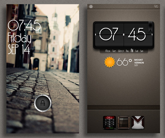
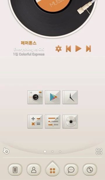
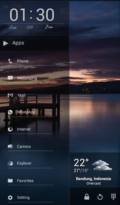
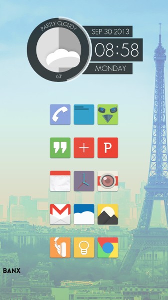
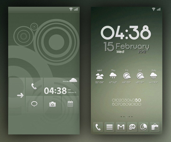
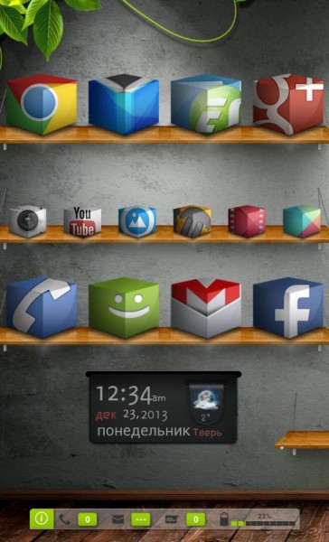
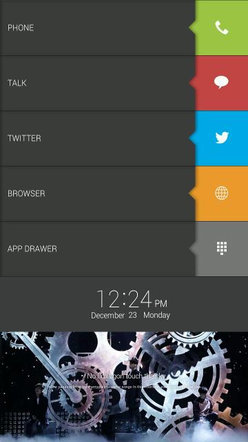
Compared to how restrictive iOS’s GUI is in terms of customization (you’re pretty much limited to changing the wallpaper and not much else), the level of customization allowed with Android is just mind-boggling–from the icons, location of buttons and docks, transition animation, number of icons allowed on the dock and home screen, how the folders look and behave, customizable swiping actions for screens, icons and folders, to countless beautiful widgets.
There are other apps that add extra functionality to the GUI without completely replacing the launcher, such as adding swipable sidebars, Windows-styled start button/taskbars, extra toggles, etc. I tried ones like Glovebox Side launcher, Sidebar Lite, Sidebar Plus, Taskbar – Windows 8 Style, and I liked Sidebar Plus the most because it allows more flexibility in what you can put in the sidebars (anything from shortcuts, widgets, to apps). Taskbar – Windows 8 Style was nice too, allowing a more familiar desktop-styled user experience. But in the end, after trying them for a while, I realized that the way I have customized Nova Launcher Prime, I really don’t need the extra features these apps offered. They are definitely very useful if you need the extra side panels, but to me, it seems easier to just use additional home screens. I guess if someone didn’t want to use a custom launcher might find them useful as add-on features to the default launcher that came with the device.
I should mention that even though I keep praising how customizable the Android/Note 3 experience is, there are some things I do think Apple/iPhone does better that I miss, such as:
-A hardware silent switch that makes turning off the sound very easy
-Power button placed at the top, which prevents accidental presses in typical usage
-Triple-press home button inverts colors (to quickly darken a background that’s too bright for viewing at night in the dark)
-Lockscreen notifications and badge counts for all apps and icons (I cannot for the life of me understand why this isn’t available to the same degree with Android. The numerous apps that try to provide this feature only does it in limited ways).
-One-stop sync for music, podcasts, videos, photos, ebooks, bookmarks, contacts, apps, etc with iTunes. Android is in dire need of a one-stop syncing solution for everything.
-The limitations of iOS does make it simple to use, so it’s both a strength and weakness
Ultimately, Â how much time and energy someone want to customize his mobile experience is a major factor in choosing between iOS or Android (other factors include app choices, Â hardware accessories, and overall ecosystem). This is probably the reason why Android has a lot of tech-savvy users who heavily customize their mobile devices.
System settings-related apps
There are a variety of notification, Â settings toggles, Â and profile automation apps available for Android, and they really do make your user experience smoother and more convenient, allowing you to place often used settings toggles and apps in the notification area, or to automatically switch to various setting presets depending on customized criteria.
Llama Location Profiles – This is one of the more popular apps for customizing how your phone’s various settingstoggle on or off  (Wi-Fi, GPS, bluetooth, mobile data, etc) and how loud the various sounds are (ringer, notification, media, phone call), using criteria like location, time of day, which apps are running, the state of the battery, which wireless signals are available/connected/disconnected, etc. I have different settings for when I’m at home, when it’s bedtime, when I’m out in loud places, when I’m in quiet public places, when I’m driving in the car, when I have my bluetooth speakers connected, etc. Although there are other apps that are even more powerful, they are also more complex and do more than I really need (Tasker is the most well-known one, and there are other similar apps).
Custom Notification EX / Notification Toggle / Power Toggles – Although these apps are similar, they have enough differences that you might want to use more than one, as some only allow certain types of toggles, or can only be places in certain locations.
I started off with Power Toggles and it’s the most flexible one, allowing you to create many app shortcuts and settings toggles in one single icon that you can place just about anywhere, as well as two rows of eight icons each in the notification area. The only thing I didn’t like about it was how rearranging the icons for the folders can be a pain in the ass (although for the notification area it’s far easier). You can also save your settings as separate presets and load them later, which is very handy when you have to redo customizations. I did find the app to be unreliable at times, not refreshing the changes I’ve made, or disappearing from the notification area, so I had to abandon it. It might be different for you, so give it a try.
I’m now using Custom Notificaition EX and Notification Toggle together and they have been very reliable. I have my media player controls mapped, as well as often used systems settings that aren’t already easily available in the notification area such as bluttooth settings, mobile data toggle, sound control sliders, and Wi-Fi settings. I also have rotation lock, flashlight/torch, and various apps such as media players, camera apps, note-taking apps, screen brightness filter presets, dictionaries, and unit conversion, so I can access the most used apps without even unlocking the phone.
Popup Notifications – This is great for forcing a popup notification screen for whatever apps you want to include in the notification list. I have on my list things like reminders, alarms, messages, missed calls, etc.Â
Notifications Tracker – If you sometimes miss certain notifications and wish you can access the list of all the notifications that’s appeared while you were away, this app keeps a record of every single notification that shows up on your device, so you can easily see what you missed.
System Apps
Here are some great system-related apps that gives you additional control in Android.
Antek Explorer / ES File Explorer File Manager – These are kind of like the Android equivalent of Windows Explorer, allowing you to navigate and manage files and folder directories. These two are the best ones among the bunch I have tried, and I like Antek Explorer the most because it’s a bit more intuitive and has a dark theme for the GUI.
Clean Master – This allows you to delete a lot of unneeded garbage from your device, such as junk files left behind during uninstalling of various apps, obsolete files, clear the RAM when too many apps and services are kept in the memory cache, etc.
Cool Tool – This one allows you to monitor your devices resources in real-time, so you can see in a glance how hard your CPU is working, how much RAM you have left, the temperature of your CPU and battery, network activities, etc.
DiskUsage – This app scans your storage and tells you exactly how much space is taken up by what, and allow you to zoom in and out of each directory to see more details (reminds me a lot of SpaceMonger for the PC).
StudioKUMA .nomedia Manager – This one allows you to manage which directories you want the media players/galleries to not scan and show. For example, if a folder containing icons and graphics for an app shows up in your photo gallery and you want it to never show up there, you can use this app to create the “.nomedia” file/folder that tells Android to not scan those files/folders during media scanning. You can do this all manually with any file explorer too, but this app makes it a bit faster/easier.
Audio Manager – This app is a fully functional audio manager, but that is a disguise. It actually allows you hide and manage hidden files/folders that you don’t want others to see. For example, you have kids that like to play with your device, or friends/colleagues that borrow your device, and you have things on there you want to keep private.
Android Tuner – Very powerful systems tool that has a huge array of different tools for customizing, monitoring, controlling, automating, and testing the various aspects your device.
Battery Widget Reborn – A simple battery monitoring tool that has a couple of nice extras like notification toggles and automating settings based on timer. I don’t use the extras and only use it because of the visual graph and battery usage log it provides.
Â
Keyboard Apps
I have always hated iOS’s keyboard. I hate that so many important keys are not available on the main screen and must be accessed in the secondary screen. The fact that even basic punctuation marks must be accessed in the secondary screen makes typing in iOS a real pain in the ass. The lack of a delete button also drives me up the wall because it is just as important as the backspace button, especially when there are no fast and accurate ways to jump between letters or words quickly. I had to use dedicated writing apps in order to get any kind of customization for the keyboard on iOS (my favorites were Nebulous Notes and Write for iPhone. The top bar allows you to place your most often used keys there, so you can quickly access them, as well as navigation keys that allow you to move the cursor easily without having to use the clunky default hold/zoom/move). But the problem is, you can only use the customized keyboards in the apps that supply them, and once you’re away from those apps, you’re right back to the default Apple keyboard.
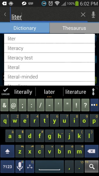
On Android, there are so many third-party keyboard apps that it blew my mind. They come in all kinds of designs, customizable skins, different features, etc. I tried a bunch of them and eventually settled on one. The ones I tested were: Samsung Keyboard, Swype, Perfect Keyboard, Easy Keyboard, SwiftKey Keyboard, GO Keyboard, Hacker’s Keyboard, and Kii Keyboard. They all had their own strengths and weaknesses, but none did everything I wanted. I had almost given up and was ready to settle on whichever one that was the closest to my ideal, but then I found A.I.type Keyboard. It has all the features that are important to me, and those features are:
-Ability to customize the top bar however I like, with all the often-used keys, as well as allow more than one page of it.
-Allow user customization of the GUI theme colors in detail, instead of only having preset themes that didn’t quite match my needs.
-Have the most flexible customization of the various keys, pages, keyboard size, layout, etc, so you can set everything up exactly as you want.
This is how I’ve customized the keyboard:
Security Apps
While there are anti-virus/malware, firewall, or anti-theft apps for Android, I don’t use them because I don’t visit shady websites or download/execute files unless I know exactly what they are. I also carry my Note 3 with a locking clip that would require a legendary master thief to take off of me without me noticing, and I never leave any mobile devices in public places; I have it with me always. The chances of me losing my phone or getting it stolen would be extremely low, and I don’t really travel anymore, or go to unsafe neighborhoods, so even getting mugged would be very unlikely. What I do need, are encryption apps, and only because in the off chance that someone does gain possession of my device, the sensitive information I carry on it will be safe. Here are the security apps I currently use:
SSE – Universal Encryption App – I use this to encrypt sensitive documents.
Photo Locker & Video  Locker – Most apps of this type only hide the photos or videos by moving them to an obscure folder or rename them, but they are still easily accessible if someone really wants to find those files. Photo/Video Locker actually encrypts the files, so it’s a lot more secure.
GPS Apps
I started using GSP around 2005, and have relied on GPS ever since. To travel/drive without GPS would be like jumping back to some archaic, inefficient time period to me. I originally used a standalone hardware GPS (Magellan Roadmate 860T), but that model’s been discontinued and there haven’t been map updates for years. When we decided to move back to the States in 2012, I was still using the Roadmate 860T, but it felt outdated and a bit clunky, so I looked into iOS GPS apps, and started using Magellan’s Roadmate app. It wasn’t perfect, but it had all the features I enjoyed on the hardware version and convenient features that other GPS apps didn’t have (except for TomTom, but I disliked TomTom’s interface). From there on, I used the Magellan Roadmate app and was fairly happy with it (although its Points of Interest and map was outdated, and in some areas a few years behind changes made to the freeway/streets. New map updates didn’t address those changes and I was very disappointed). When I switched to Android, I had to look for a new GPS app, because Magellan Roadmate is not available on Android.
I tried several Android GPS apps–one like Waze, CoPilot, MapFactor, MapQuest, Google Maps, Sygic, Wisepilot, Navfree, Scout, and OsmAnd. None of them had all the features I was looking for, or even when one came close, there were other issues. I’m pretty picky about GPS apps, and the features really important to me are:
-Reliable routing that’s efficient and  fast.
-Live traffic update/rerouting when there’s heavy traffic
-Up-to-date maps and Points of Interest
-Able to save your own list of destinations as favorites
-POI search for nearby restaurants, shopping, gas station, hospital, etc
-Speed limit monitoring/warning
-Show current speed, how many more minutes until destination, what the time will be when reaching destination
-Show the next couple of turns so I can get in the right lane fast enough
-Shows highway exit lanes visually with detailed graphics.
-Color-coding of the last couple hundred of feet of the route before I reach the next turn, so I can easily see the turn is coming up
-Local map storage so I don’t need to rely on cell signal.
-Can edit/add/subtract destinations in a multi-destination route.
-Can choose to avoid highway, or use highway only, choose fastest or shortest route, etc.
-Has all previous destinations listed in the history.
-Can pin current location (for finding the car later, or an off-road location).
-Search results allow direct dialing of phone number of the business.
-Automatic day/night theme switching
-Can mute all audio directions/warnings.
-Ideally free, or charges you only once instead of monthly charges for features like life traffic updates, map updates, etc.
As you can see, that’s a pretty tall order, and it’s no surprise that just about every GPS app has failed in some way. The ones that came the closest were Waze, and Sygic, and I’m already familiar with TomTom from the iOS version, so I would say that comes close too, but unfortunately they each have their own problems.
Waze is a great idea, and because it relies user-generated content, the map and POI updates are extremely fast, and traffic reports are instantaneous (including the reporting of roadside hazards). Participating in Waze also makes it more fun–you feel like you are contributing to the community where drivers help each other out by providing up-to-the-minute information/reports, as well as being able to message each other if there’s need for help/suggestions. The main problem with Waze is that its very light on actual features–even the typical ones you find in most GPS apps like speed limit warnings, history tracking of past destinations, arranging favorite destinations in the order you want (or divide them into categories), lane guidance, local map storage, etc. But it is free, and it does some things better than paid apps that cost up to $50.
Sygic is a paid app, and it has all the bells and whistles I expect from a paid app, but it has reliability issues, such as getting confused whenever I’m at an intersection. The screen would spin around as if losing tracking of my car’s orientation, and only after my car starts moving would it settle down. That is extremely annoying because getting confused at intersections is the worst possible place. Sygic also charges monthly fees for features/services that are free in other apps, such as live traffic updates.
I didn’t have any major problems with TomTom when I used it on iOS, but its map is just as outdated as Magellan’s. As far as I know, their maps for the area I live in are still outdated, where  all the changes to the freeways, streets, and POI’s have not been updated in the last several years. This is simply unacceptable in this day and age, especially when other GPS apps have updates that reflect changes so quickly.  For $50, it’s almost like a ripoff (and that’s how I felt after paying the same amount for the iOS Magellan Roadmate app, only to be faced with severely outdated maps).
So my search for the ideal GPS app continues. For now, I’ll continue to use Waze. It’s lacking in many ways, but it gets the job done, and at least I’m not getting lost.
Calendar/Schedule/Tasks/Reminder/Alarm/Notes Apps
When I was still on iOS, there were two apps that I absolutely loved and depended on, but have no Android versions, or even comparable equivalents. On is Awesome Note from BRID, and the other is Alarmed from Yoctoville.
Awesome Note is the most well-designed calendar/schedule/tasks/notes/reminder app I have ever come across, and I have tested dozens of them on both iOS and Android. It is so feature-rich, intuitive, visually appealing, and reliable that I even considered not switching to Android just because I loved the app so damn much. I love that it isn’t just a task/schedule/calendar/reminder app, but also a note app that allows you to use it like a notebook, journal, and allow you to insert media into the notes. I also love how the entries can be categorized into folders that are very intuitive to navigate, and the reminders/tasks are very easy to create, but also very flexible, allowing you to easily create notes and subtasks within each entry, or set them to repeat on exact the days of the week or month, and so on. It also synced with Evernote and Google Drive.
Technically, Awesome Note does have an Android version, but it is only available on the Galaxy Note 8.0, and I have no idea why the arrangement between Samsung and BRID is so specific. I assume Samsung is paying BRID very well for the exclusivity–enough to entice BRID away from the possible earnings available from the entire Android platform. There are no other apps out there that can match Awesome Note feature-for-feature, so I have to use a combination of different apps.
Alarmed is one of the smartest designs for an alarm/reminder app I’ve ever seen. It does everything you’d expect an alarm app with advanced programming, and then adds the genius and extremely useful paid feature, which allows you to customize repeating reminders down to the last detail. For example, let’s say you have to take medication every three hours, and you set it to repeat every three hours. But if when it goes off, you’re busy and cannot stop what you’re doing, so you use the popup snooze option to set how long to snooze (anywhere from five minutes to a day), and then when the snooze period is over, you can either choose to snooze again, or take the meds, and let the alarm continue counting down to the next three-hour interval. The app will automatically start counting down to the next three hours starting from the time you decide to let the app continue. All other alarm/reminder apps are much more rigid and only allow you to set specific times for the alarms/reminders, instead of adjusting to the exact moment when you have actually performed the task and then allowed the app to continue counting down to the next repeat.
Alarmed also lets you set the reminders so that they only activate for a certain number of hours a day (such as starting in the morning and stopping at bedtime). You can also toggle on and off the reminders so they won’t repeat (such as when you’re going to be out all day doing something important and don’t want the alarms to bother you).
I searched high and low for equivalent alarm/reminder apps for Android and found exactly none. Even when I was on iOS, I had gone through a bunch of different apps before finally finding Alarmed. I’m actually very surprised that other app developers haven’t copied the advanced features of Alarmed.
I tested a ridiculous number of apps in my quest to find an equivalent to Awesome Note and Alarmed, and among them were ones like AA Task, aCalendar, Alarm Clock Plus, Calendar Snooze, Calendar+, Calendar+Note Everything, COL Reminder, Cozi Family Calendar, DigiCal Calendar, Easy Calendar, Business Calender, Business Tasks, Evernote, Extensive Notes, FreeNote, Genial Writing, GNotes, Google Tasks Organizer, GTasks, HMarik Reminder, Jorte Calendar, Life Reminders, n’4get Reminder, Notable, Notebooks, OneNote, ProDo, Pushpin Reminders, Remember The Milk, reMind Alarm Clock, Som Todo, Springpad, Task List, Tasks, Tasks N Todos, To Do Reminder, To-Do Calendar, ToDo List Task Manager, Todoist, Tofu Notes, Wrike, Wunderlist,etc.
In the end, I settled on these following apps to match the features I had with Awesome Note:
Business Calendar (with the free Business Tasks add-on) – This combo takes care of the calendar, to-do, and reminder aspects of Awesome Note. What this combo has over other Android apps are this set of features in the same app:
-Ability to move events/tasks between categories (such as appointments, shopping, domestic chores, work-related, etc)
-Ability to pick exactly which days of the week to repeat reminders
-Ability to attach media to events/tasks
-Ability to create sub-tasks
-Ability to change themes and customize colors
-Better interaction with the widgets, and more customization options
-Syncs with Google Calendar/Tasks
GNotes – This one takes care of the notes portion of Awesome Note. I find it more intuitive to use than Evernote (which has a terrible GUI), while having all the important features of Evernote that I actually use. It allows media attachments, and has a nice cloud-based desktop web browser extension that syncs with the app. It also has a dark GUI theme, which most note apps do not have (I can’t stand GUI’s with bright backgrounds. It’s both glaring to look at–especially in the dark–as well as draind battery faster).
For handwritten notes, Samsung’s S Note and Action Memo are just perfect.
I was never able to find anything like the advanced features in Alarmed (and if you know any, please contact me), so I’m just using the default Samsung alarm app, which is actually pretty good. It isn’t nearly as flexible as Alarmed, but it does match the features of most of the alarm apps on Android, and much prettier than most. (This is something that people don’t often mention–that the default apps from the phone manufacturer are often some of the most beautiful, because they reflect the ability of expert GUI designers working for giant corporations, while most third-party apps are often hideous looking, obviously designed by the programmers instead of expert GUI designers.)
ATimeLogger – On the computer, I use a really nice time/project tracker app called Klok 2, and I wanted to find something similar for the Note 3, and this one was the one I liked the most, due to how easy it is to use. The widget is great–allowing you to run, pause, or stop any task/project easily. Having this app makes it possible for me to track activities I couldn’t track with Klok when away from the computer.
Multi Timer StopWatch – This app is great for more complicated timer needs, such as setting a timer and then also setting regular intervals. For example, I can set an alarm that lasts fifteen hours to be used each day, and during those fifteen hours, I can set twenty minute intervals so I’m reminded to get up and stretch and move around a bit, preventing me from sitting all day (which is horrible for my health and shortens my lifespan). I also have one where I set for six minutes, and with one minute intervals, so I can use it to do a series of six stretching exercises. This way, I don’t have to keep fiddling with the timer and reset an one-minute timer every time I move onto the next stretching exercise.
iPro Habit Tracker – I wanted an app that tracks my success rate at keeping certain healthy habits, and after testing several similar apps, iPro Habit Tracker ended up as the winner for it’s more complete features.
Habit Goal Monitor – This one doesn’t have the fancy summary graphs of iPro Habit Tracker, but I like it’s widget a bit more, allowing you to see more details without opening up the app.
Media Apps
Having a mobile device that can take external memory card means you can put far more media on your device, and this was one of the major attractions of the Note 3. So of course, it’s important to have quality media apps.
Tactile Player – Ever wished you could control media playback with the hardware buttons on your mobile device? This app is very similar to the iOS app I used to use called External iPod Control (requires jailbreak), and it was one of the iOS apps I hoped there would be an Android equivalent, because I really think touchscreens are terrible for controlling a music playback device. Music playback control should not require you to look at the screen, and should allow you to control the player even when the device is in your pocket. This is one aspect of the Apple design philosophy that I think they got so, so wrong. In designing the touchscreen, they threw the baby out with the bathwater. IMO, mobile devices should all have options to control media playback with the hardware buttons, and with Tactile Player, you can do just that. You can customize how you want to control the playback with the hardware buttons, and the paid version gives you a widget so you can turn the app on and off easily.
Neutron Music Player – This is a music player for audiophiles. It is by far the most advanced music player with features that you will not find in other music player apps–features such as 64 audio processing, a crossfeed (to make headphones sound more natural like speakers) that actually works properly (the ones you find in apps like Poweramp are NOT proper crossfeeds and sound terrible), dithering, Ambiophonic surround sound, parametric EQ, resampling, phase inversion, etc, as well as more common audiophile features like support for a wide range of lossless formats, replay gain, normalization, etc. If you are serious about music, this is the only choice.
Vanilla Music – If you want a more simple music player that doesn’t have lots of bells and whistles but has replay gain, this is it. The main reason you’d want to use this instead of the default Samsung music player app, is because the Samsung app does not have proper replay gain (although it is much prettier).
BSPlayer – The best video player app I’ve tried (and I’ve tried a bunch). It supports lots of different file formats and its seek function is the smoothest. It’s the only video player you need. If for whatever reason it doesn’t run well on your device, you can try QQPlayer and MoboPlayer–they are good choices too (though not as smooth as BSPlayer).
F-Stop Media Gallery – The best gallery app I’ve tried. More flexible, feature-rich, and faster than the default Samsung gallery app.
RSD Photo Frame – The best homescreen slideshow/picture frame app I’ve tried. You’re not forced to use cheesy frame designs and can make it as simple as you want, as well as have more options in how often the wallpaper changes (up to 24 hours interval). It also detects device rotation and will rotate horizontal images accordingly.
Rescan Media – If for whatever reason the changes to the media content you’ve made to your device isn’t showing up in the apps you use, you can use this app to force a rescan of all your media.
Media Streaming (between computer and mobile device)
AirStream - I tried streaming apps that can stream between the computer and mobile device–ones like VLC Streamer, VLC Direct Pro, Tonido, etc, and none of them were as fast, smooth, and simple to use as AirStream (some of them even uploaded your media to the cloud, and then download to your device, which is only useful when you are away from home, but useless when you are at home and have Wi-Fi networking). The speed and efficiency of AirStream impressed me so much that even the fact it required a desktop companion software to work didn’t bother me. I can stream HD videos from my computer with Airstream and fastforward/seek instantaneously without any lag, and often get smoother response than I could even get from one of my laptops.
Web Apps
Dolphin -Â I used Dolphin when I was on iOS, and since it was already my favorite mobile web browser, it made sense to stick with it when I switched to Android. What I like about Dolphin is the way it handles fullscreen and tabs, and the gestures are useful as well. I also like being able to send opened tabs between Dolphin and desktop Chrome, so I can continue to read a website no matter if I’m on the computer or away from it.
I’ve tried some of the other well-known mobile web browsers out there like Chrome, Firefox, Maxthon, Opera, Boat Browser, Next Browser, as well as the default Samsung web browser, and they all have their own unique features. I think it’s really matter of personal preference. I’ll go on using Dolphin and supplement with the other browsers when/if Dolphin has problems with a particular site.
Â
eReader/Dictionary/Translator/Writing Apps
Kindle – I’ve tried a bunch of other eReader apps when I was on iOS, and Kindle was the best one, so it made sense to continue with it on Android. What I like the most is the built-in offline dictionary; it’s better implemented and more intuitive to use than other eReaders that also have built-in dictionary.
Dictionary.com – I used this when I was on iOS, and it’s still one of the best. There are other really good ones like Merriam-Webster, WordWeb, English Dictionary – Offline, Dictionary, etc, and I use all of them (I’m not weird–all writers are like this).
Screen Control
Rotation Anywhere – This app allows you to rotate the screen no matter what app you’re in, and you can customize it so specific apps will always be launched in the orientation you want.
Screen Filter – This app allow you to apply a dimming filter to your screen, since the lowest setting for the screen brightness is still too bright when viewing in total darkness. I especially like how you can create different presets in widget form so you can jump between settings quickly.
Screen Controls – Don’t you hate it when you launch apps such as the camera, gallery, games, or video players, and you have to go and change the screen brightness? This app allows you to have individual custom settings for any app, so that when it launches, it’ll be at the exact brightness you want. You can customize the screen timeout for each app too.
Utility/Misc. Apps
Sidewalk Buddy – Yes, it is a really bad habit to walk and use your mobile device’s screen at the same time, as it can cause accidents. But if you really must do it, at least use this app, which activates your camera and puts a live feed in a resizable window on your screen, so you can regain some of your situational awareness.
Unit Converter – As long as some countries refuse to use the standardized metric system, we’re always going to need unit conversion apps like this.
1Weather:Widget – Excellent weather widget that is very comprehensive, and have a wide range of different widget types to choose from.
Dash Clock Widget/Extensions – This widget allows all kinds of extensions that do different things, and although I stopped using it (I prefer individual apps to extensions, as they provide more functionality and customization), I think a lot of people will find it very useful.
Flashlight Apps
It might be strange to some people that I have more than one flashlight app, but if you have EDC inclinations or are a full-blown EDCer, you’ll understand exactly why.
Flashlight – This flashlight app has unique features like mimicking emergency police, firefighter, ambulance, tow truck, and traffic stop signals with the device screen (handy for emergency situations), as well as Morse code, strobe, and SOS signals.
Tiny Flashlight – This flashlight allows the fastest strobe of all the flashlight apps I’ve tested, and its traffic warning light feature is nice too.
LED Flashlight – This flashlight allows you to turn on the front-facing camera while the flashlight is on, so you can use the camera to look in crevices or under furniture to find stuff.
High-Powered Flashlight – This flashlight app has a built-in compass and a strobe, so it’s handy for when you need to find your way in the dark when out in nature, or signal for help.
DashLight – The most straightforward and simple flashlight app, and the only one I’ve tested that allows a simple on/off toggle widget. (Strangely, the one the comes with Touchwiz is not that bright, so that’s why I needed a replacement in the first place.)
Art Apps
For those of you who like to draw and paint as a hobby, or are serious artists, there are a couple of really nice mobile art apps.
Autodesk Sketchbook – This is commercial app, but is bundled with the Note 3. It’s one of the best art apps out there, and comes in various versions, including a free version, a tablet version, and a phone version. Autodesk is one of the most prominent companies in the world of visual creation products (who owns pretty much most of the professional software used in movie special effects, 3D animation, industrial design, product visualization, etc)
Sean Brakefield’s Infinite Series – This guy develops a whole bunch of different art-related apps. Infinite Painter is the one most people will want to use (there’s a Note version, so make sure you get the right one).
There’s also Clover Paint and Photoshop Touch, and both look like they are quite good, but there aren’t any free or trial versions, so I can’t recommend them, since I don’t use apps that don’t let me test drive first.
Music-making Apps
These are for all you musicians, composers, songwriters, and sound designers.
Caustic 3Â – One of the most impressive virtual music studios on Android.
FL Studio Mobile – Another virtual music studio (iOS version available too). This one is basically a variant based on Xewton’s Music Studio on iOS, but Xewton does not have an Android version.
SunVox – A virtual music studio that’s already legendary on iOS, now available for Android too.
Audio Revolution Mobile DAWÂ – The best multitrack digital audio workstation on Android.
G-Stomper Beat Studio – A live-performance step-sequencing production tool.
MorphWiz-Play – Jordan Rudess (of Dream Theater) made a huge splash on iOS with his MorphWiz performance virtual instrument, and this is the Android version.
EerieSynth – Similar to MorphWiz-Play
PocketBand Pro – A music-making studio that allows you to collaborate with friends using cloud-based connection.
Chordbot Pro – A chord sequencing/accompaniment tool.
Piano Companion:Chords,Scales – Chord and scale finder for keyboard/piano players.
Chord! (Guitar Chord Finder)Â – For guitarists that wants to find chords easily.
Tuner – gStrings – A flexible and handy tuner app that can be customized for any instrument.
Piano Sight Reading – A training/practice tool that helps your sight-reading skill
Galaxy Note 3: The life companion device
It’s been a frustrating, but ultimately rewarding experience to migrate from the iOS ecosystem to Android, and I’ve learned a great deal in my research and tests. There have been a couple of times when I wanted to throw the Note 3 across the room because I just couldn’t get certain things to work, but I’m glad I didn’t, as that would have been a very costly temper tantrum. I eventually solved the problems, found the right apps and the right settings, and now the Note 3 is even more of a life companion device than the iPhone 4 ever was to me, simply because it is capable of doing more and the Android ecosystem is much more open (this is even considering my iPhone was jailbroken).
I hope all the research and testing I have done will help others who are looking for answers and tips like I was, and the app recommendations contain some nice surprises that make your Note 3/Android experience more enjoyable and productive.
If you are interested in Galaxy Note 3’s camera test and camera app recommendations, here’s part 2 of article:
Part 2 – Samsung Galaxy Note 3’s camera test & recommendations for best Android camera apps
If you want to learn how to take better photos, here’s part 3:
Nicely done. Appreciate the work you put into this.
nice work …. thanks
Amazing, this is the most comprehensive compilation that I have seen. I have been looking for some time for something like this since I am a former iPhone 5s convert. I was all about Apple but lately became extremely bored with their lack of innovation. I will stick with Apple for my iPad and Macbook Air, but Samsung for my phone. Thanks again for the great information.!!!
Awesome Job. Thanks, I love my phone even more now…
What a truly impressive and useful summary you produced! Thank you so much for the initial walkthrough on the planet Android. I’m not switched over yet, but when I do I am sure I will return to your summary over and over..and over again…Please leave it up for us all….forever..? Thanks again!
Fantastic summary – you’ve given me some app ideas for my own Note 3 (and I’ve been in the Android ecosystem for about 4 years now!) That ring also looks incredibly useful. I have small hands, and that looks perfect.
I wanted to write to ask, is there a reason you stayed away from many Google apps? I can’t live without Google Now or Keep. I’m an incredibly forgetful person, so these have been lifesavers.
Also, what do you think of the native Samsung apps on this phone? I thought on the S3 that they were mostly useless, but with the Note, I’m finding myself using them more and more.
Thanks for all the research and patience you had to have put into this undertaking! You nailed it on the head – one of the best things about Android is that it’s so open and customizable, but many people don’t put in the time and effort to set it up and thus find themselves frustrated with the platform.
Cheers!
@Demiera – The Google apps just never really appealed to me, since the features usually lagged behind other similar third-party apps, or the GUI had poor design decisions, or had too many features I don’t need while only a few of the ones I do. The way I choose apps (and pretty much anything else in my life) is a lot like the story of Goldilocks–I’m pretty picky and know exactly what I want, and am willing to go the extra mile to search, test, and compare in order to get exactly what I want (and then write long-winded blog posts/amazon reviews). 😀
The Samsung native apps range from excellent to useless, and I think it depends mostly on the person. I use the Clock, Calculator, Active Memo, S Note, Camera (for the fancy video modes), S Translator, and Sketchbook Pro (although it’s a licensed product and not native), while all the other apps are useless to me, or missing important features. I would assume the folks who use Note 8 loves Awesome Note (which is also a licensed product), and I wish it wasn’t exclusive to Note 8.
Thank you for your information. Best I have seen yet. Where did you find the first customized launcher homepage image you posted? the simple brown with the flip clock. Can this be downloaded or does it have to be recreated?
@Mike – Here’s a link to the original creator who made the layout: http://vanessaem.deviantart.com/art/Lonely-Street-327113070
Wow! I took the plunge from iPhone 4 to Samsung Galaxy Note 3 this weekend and I am going through so much of the same pain. I am just barely into reading your article here but I can see how I am going to save hours of my life by reading about the experiences that you have shared. Thank you for writing this article!
Thanks so very much for your thorough and detailed analysis. I’m facing the same switch, myself, and I really appreciate it.
What a fantastically useful and supremely comprehensive document. Many thanks for sharing your experience with those of us who are planning their escape from “the Apple Walled Garden”. I’m still using an iPhone 3GS which I bought when that handset was Apple’s latest offering. Although I like how Apple’s products just seamlessly work together, I’ve become increasingly frustrated with the lack of customisation offered to users of IOS. I’ve decided that, while the iPhone 6 Plus may at last give me the screen space that I need, I don’t really want to stay with (and be governed by) the over-restrictive Apple philosophy that’s embodied in IOS. So, assuming it turns out to be as good as expected when it eventually hits the streets, my next handset will be a Galaxy Note 4. I’m sure I’ll be making full use of your document once I get my new phone. Many thanks again.
Just want to say thanks for such an extensive article and testing.
Much appreciated!
I remember when people were hesitant to switch from their Apple ecosystem to the Android ecosystem. It wasn’t easy to do back in the day, but I have to say it’s easier now. Hopefully, more people will start to embrace this change.